When choosing tiles for a bathroom, there are a number of gorgeous ways to style them. You can choose to go seamless and pick a single kind of tile to cover the floors and walls or prefer a sense of ‘contrast’. Well, here’s some good news - it’s now easier to pick multiple tiles for a single space without making it look overwhelming! All you need is to focus on the following 6 design rules to get the space look cool and not tasteless!
Same Shape, Same Color Family
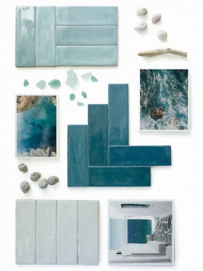
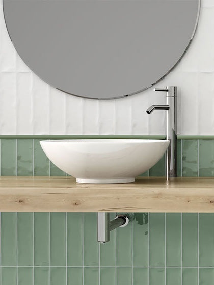
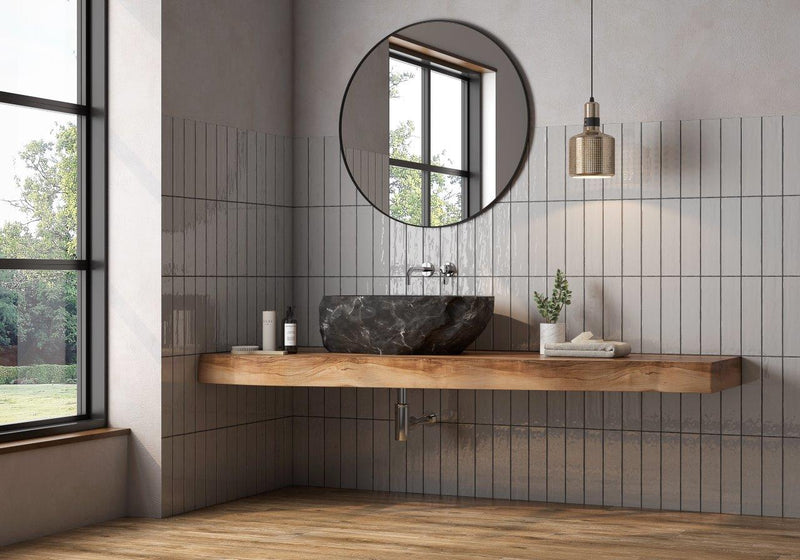
This contemporary bathroom model displays the subway tiles laid out vertically to add depth and ultimate dimension. To create a sense of connectivity, the hue of the tiles belongs to the same color family - teal, in this case. Furthermore, ensure to bind the space with the help of white marble natural stone or tiles on the floor.
Same Color, Different Shape, Different Finish
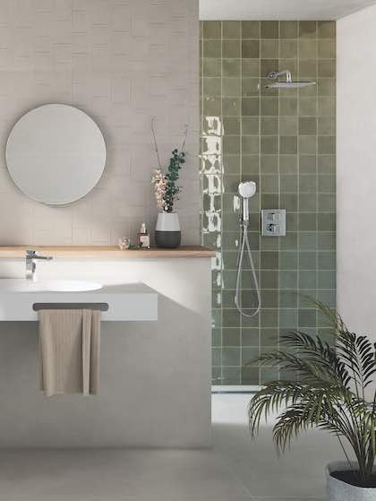
Looking to be slightly more experimental? Well, this latest bathroom tile design showcases the blend of a similar color palette in varied finishes and shapes. The glossy subway tiles make a great wainscotting statement in amalgamation with square patterned tiles that reach up to the ceiling.
Same Shape, Different Colors
This monochromatic bathroom flaunts the beautiful blend of black and white tiles in the same shape (square) to add a sense of harmony and hierarchy. To break the monotony are the zig-zag tiles laid as an accent to accentuate the space and make it further look eye-catchy and visually interesting.
Same Shape, Same Color, Simple Walls

Especially with an intriguing tile shape such as a hexagon, you must ensure to keep your walls sleek and simple. Create an out-of-the-box hexagon tile design on the walls and continue to the floor and let the remaining walls be simply white tiles or white paint. Infuse a bold color on these hexagon tiles for added visual interest and contrast!
Same Color, Different Shape
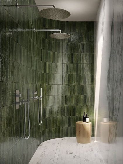
Who doesn’t admire the look and feel of a one-toned bathroom, right? Well, if you’re drawn to a specific hue or simply looking to make your bathroom appear larger and airier - it’s ideal to choose a single hue for the tiles, but in a different shape. The walls could play the herringbone way followed by the floors in classic square or rectangular tiles.
Accent Everything
This contemporary style bathroom displays the use of bold black glossy tiles on the wall as opposed to matte-finish marble tiles on the floor. The hue of both these tiles belongs to the same family but the flooring seems to be slightly lighter (charcoal gray). To top it all is the light oak wooden texture on the vanity as well as the floating shelves!
Conclusion
Mixing and matching tiles in a bathroom space can be quite fun yet challenging. Of course, you need to consider the above-mentioned design rules and further add a perfect punch of creativity to spark joy and distinctiveness. So, which bathroom tile combination did you admire the most? Well, do let us know in the comments below!

